Crafting Beauty: A Showcase of Dynamic Branding Design
Branding & Website Design
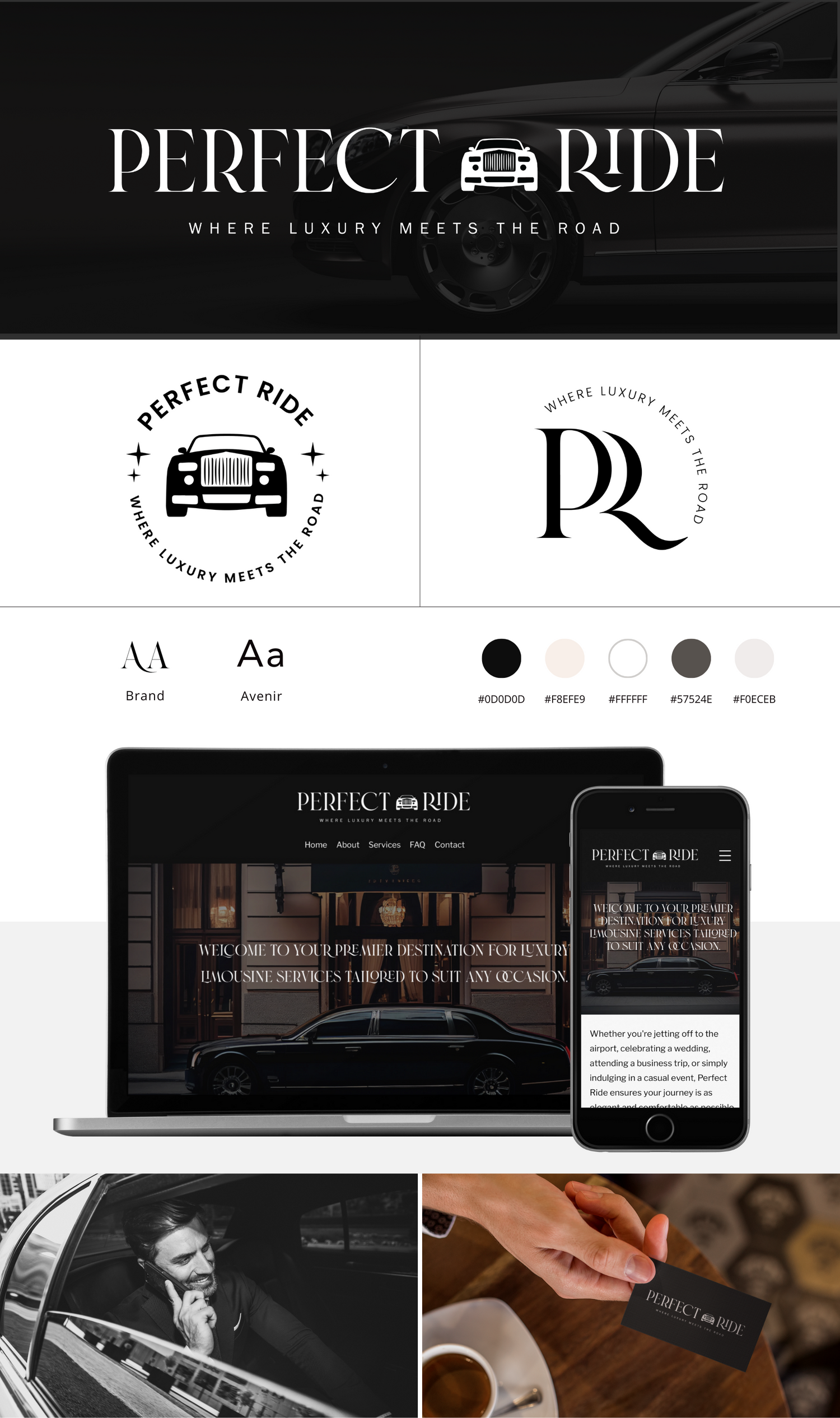
Perfect Ride LLC
Objective: Establish a strong brand identity and create a user-friendly website to attract customers and enhance their online presence.
Approach:
Brand Identity Development: Use the serif font "Brand" and san serif font 'Avenir" for a classic yet modern look; Chose a color palette of black, white, and light beige cream for sophistication and professionalism; Crafted a sleek, minimalist logo symbolizing movement and transportation.
Website Design and Development: Designed a clean, intuitive layout with easy navigation; Maintained consistency with brand colors and typography; Integrated high-quality images of luxury vehicles and drivers.
Results:
- Established Strong Brand Identity.
- Increased website traffic and inquiries.
- Simplified booking process led to improved satisfaction.
- Noticed a significant rise in bookings and revenue.
Website Design
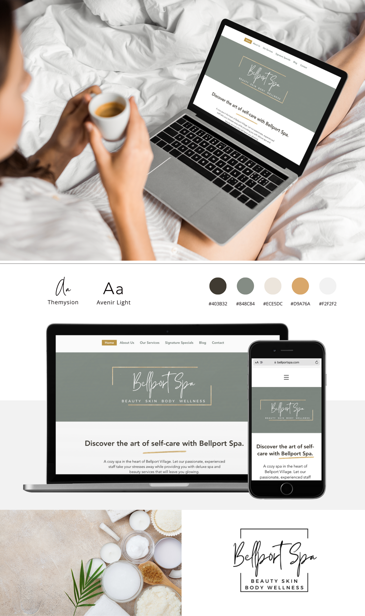
Bellport Spa
Objective: Elevate Bellport Spa's online presence to match its luxury brand and serene atmosphere.
Approach:
- Used elegant font pairing: script for sophistication, sans-serif for modernity.
- Selected calming colors like musky green, light beige cream, and touches of gold for a premium feel.
- Incorporated subtle gold lines for sophistication.
Results:
- Captured the spa's ambiance online, increasing engagement and inquiries.
- Enhanced user experience led to improved conversion rates.
Conclusion: With a blend of professional design elements, Bellport Spa's new website reflects its commitment to luxury and excellence, providing a captivating platform for visitors to explore.
Branding & E-Commerce Design
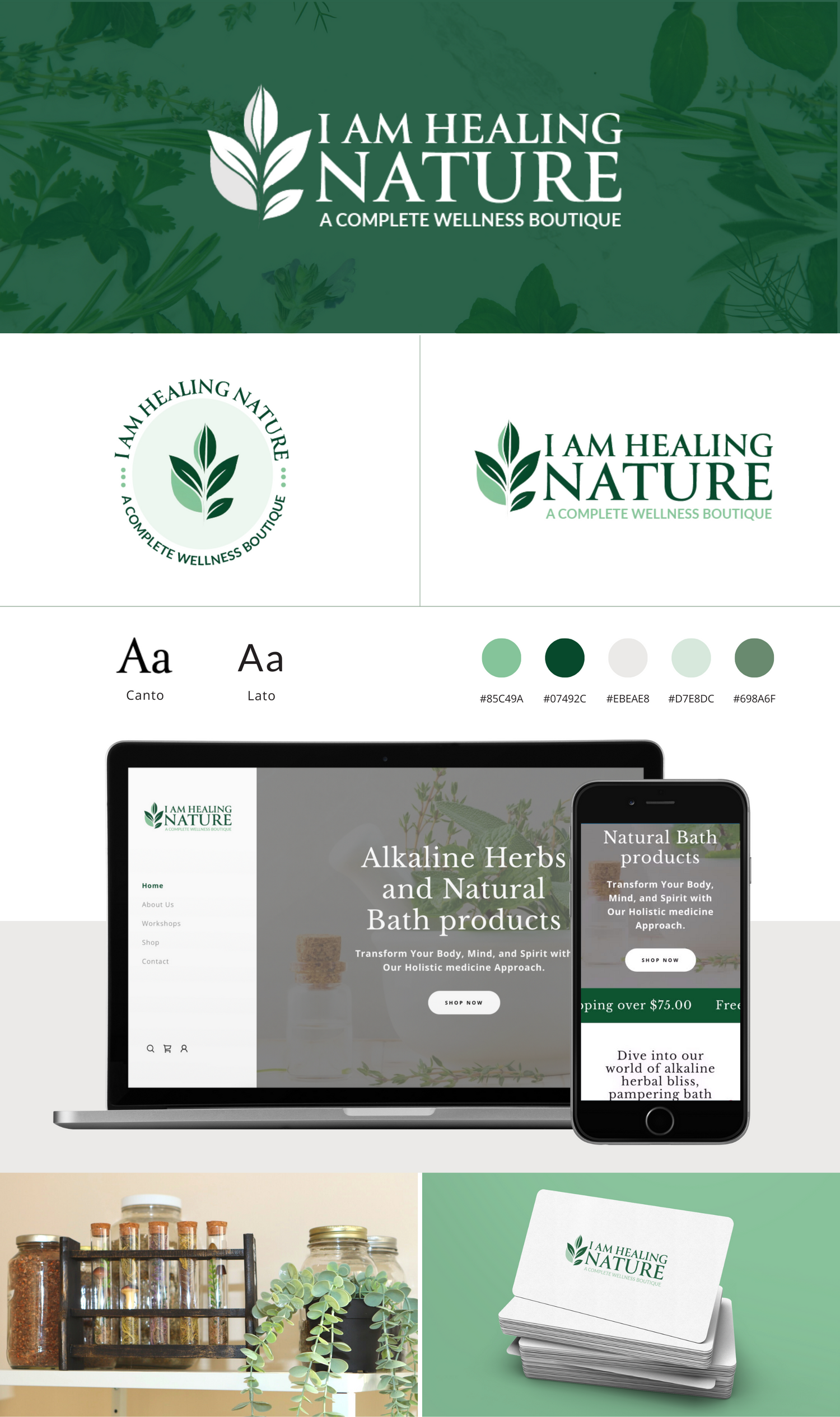
I am Healing Nature
Branding:
- Embraces nature with earthy green colors, symbolizing growth, health, and environmental harmony.
- Reflects purity and authenticity of Alkaline Herbs and Natural Bath products.
- Evokes serenity, inviting customers to connect with nature's healing properties.
- Utilizes an elegant serif font paired with a modern sans serif for sophistication.
E-commerce Design:
- Features a user-friendly interface for seamless browsing and shopping.
- Showcases high-quality product photography, capturing natural beauty.
- Provides detailed product descriptions to empower customer decisions.
- Implements secure payment gateways and efficient shipping methods.
Overall design and layout exude professionalism and trustworthiness, reinforcing the brand's commitment to quality and customer satisfaction.
Branding & Website Design
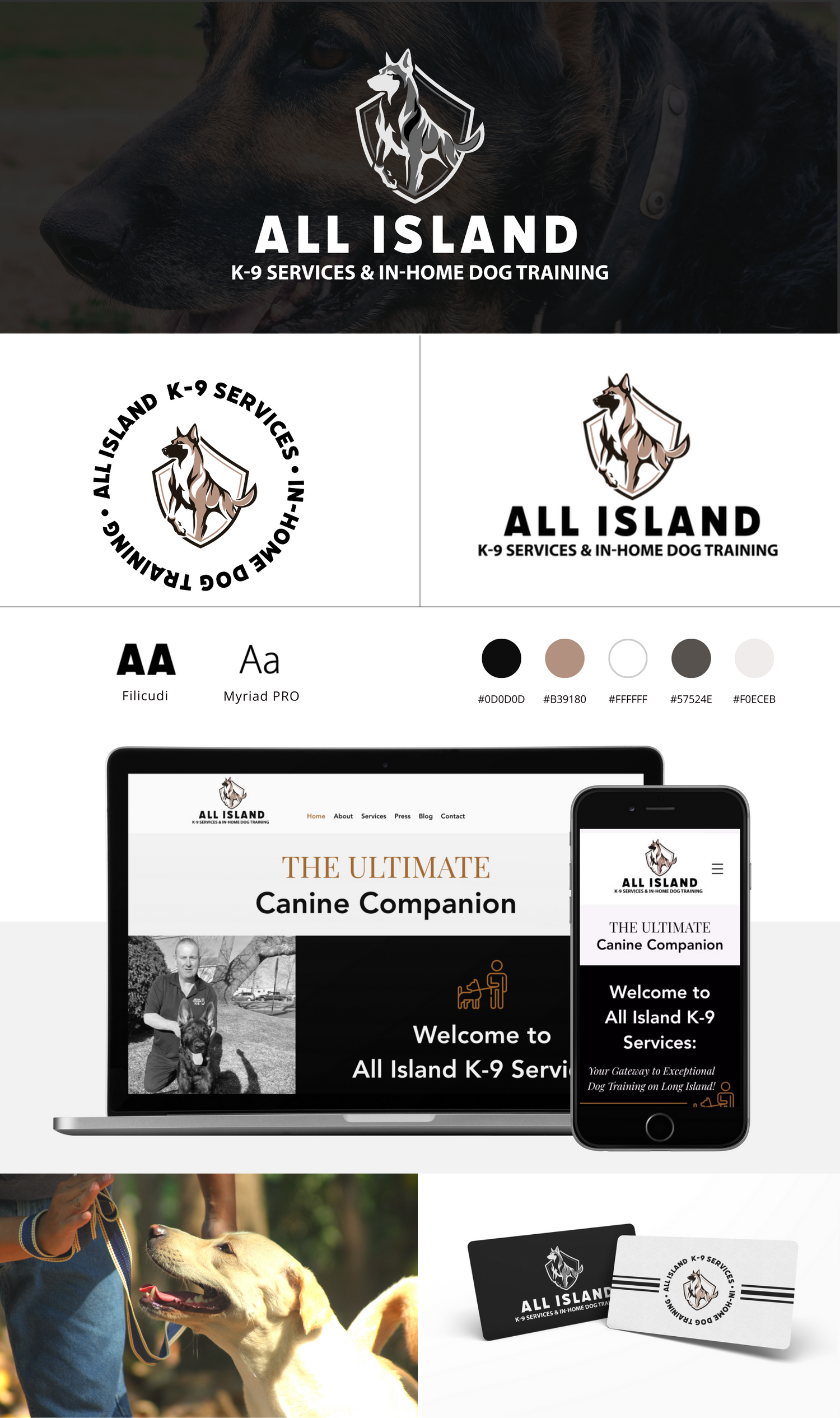
All Island K9 Services
Branding:
- Color Palette: Black and beige tones convey professionalism and warmth.
- Typography: Elegant serif headings paired with modern sans-serif body text for a refined look.
- Logo: Minimalist yet impactful, reflecting canine training & home comfort.
- Visual Elements: Subtle imagery of dogs and homes resonates with the target audience.
- Tone and Voice: Friendly & authoritative communication instills trust in potential clients.
Website Revamp:
- Layout: Clean and intuitive design enhances user experience.
- Color Scheme: Consistent black and beige palette maintains brand identity.
- Responsive Design: Fully optimized for mobile devices.
- Content Organization: Key services, testimonials, & contact information prominently featured.
Design principles aim to enhance the brand's online presence, clearly communicate services, and attract clients seeking personalized canine training solutions.
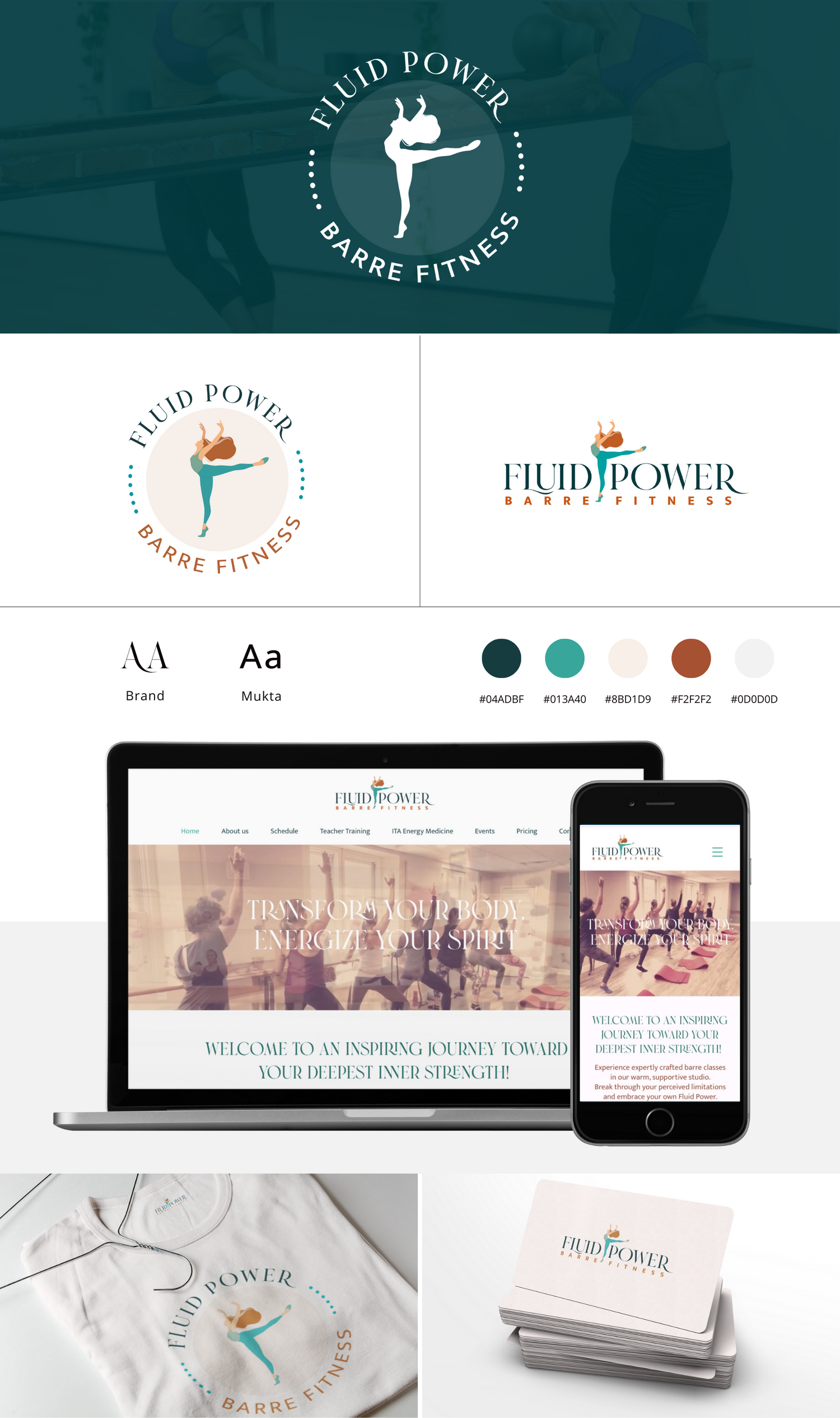
Branding & Website Design
Fluid Power Barre Fitness
Branding Revamp:
Modernity and sophistication through a fresh visual identity.
- Earthly Palette: Deep green and burnt orange tones evoke vitality and energy.
- Elegant Typography: Pairing elegant serif with clean sans-serif fonts for refined messaging.
- Coherent Brand Voice: Consistency across channels reinforces brand identity and values.
Website Revamp Design:
Ease of navigation and intuitive user experience.
- Modern Interface: Dynamic design captivates visitors and encourages engagement.
- Mobile Optimization: Ensures smooth experience across devices.
- Enhanced Visuals: High-quality multimedia showcases offerings and enhances aesthetic appeal.
Fluid Power Barre Fitness now embodies sophistication and modernity, primed for sustained growth in the digital realm.
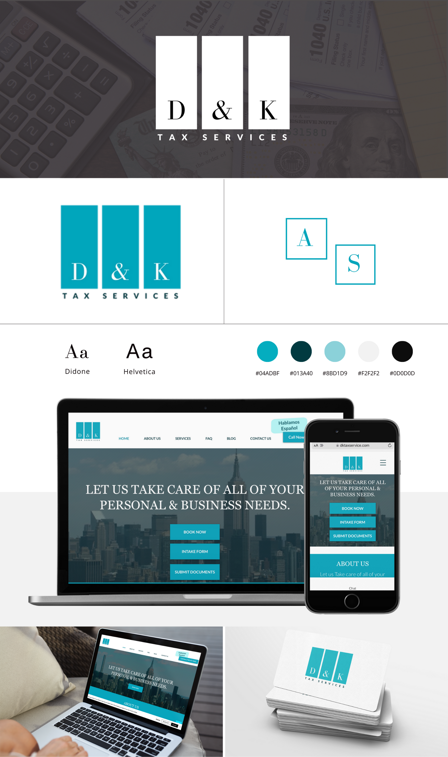
Branding & Website Design
D&K Tax Services
Branding:
- Logo features serene turquoise blue color scheme.
- Utilizes an elegant serif font for a timeless aesthetic.
- Sans-serif font chosen for pairing, enhancing readability and modernity.
Website Design:
- Sleek and professional design reflects brand identity.
- User-friendly navigation ensures seamless browsing experience.
- Highlights expertise and dedication of D&K Tax Services.
- Harmonizes with brand's aesthetic, exuding professionalism and trustworthiness.
D&K Tax Services presents a captivating brand identity and sleek website, exuding professionalism and trust.
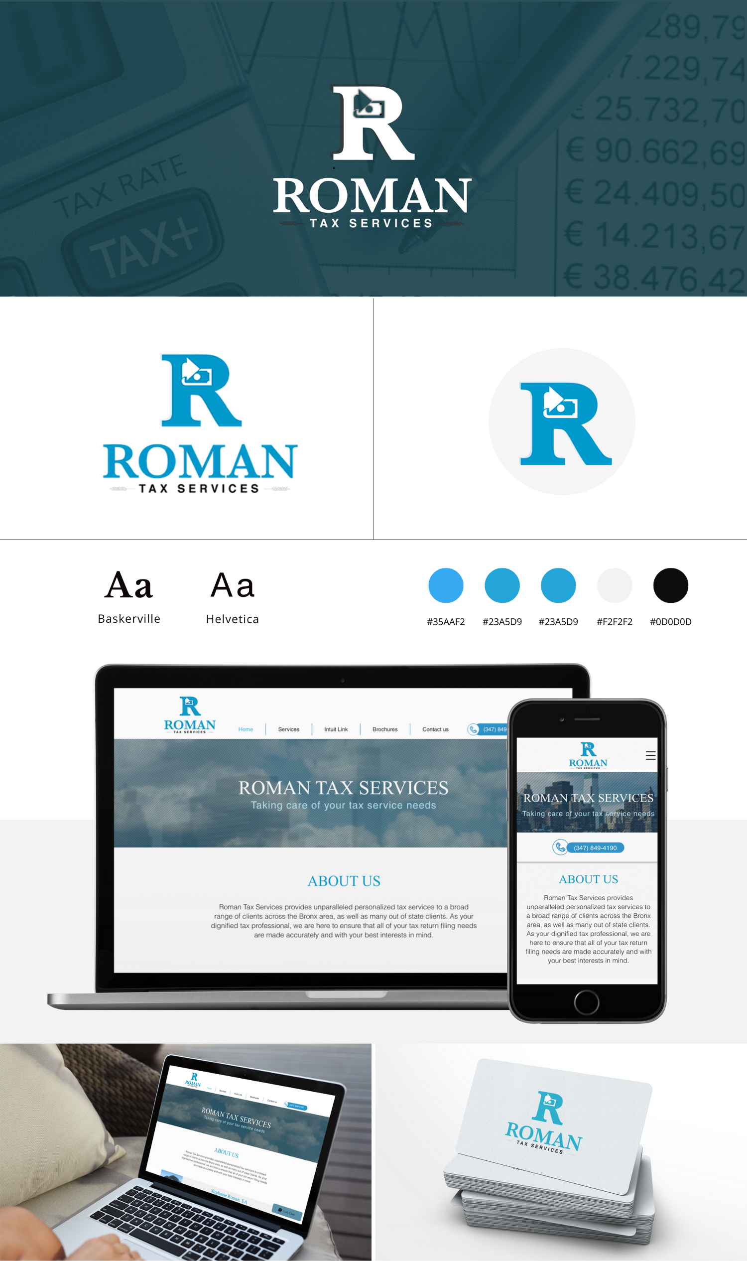
Branding & Website Design
Roman Tax Services
Branding:
- Clean and classic logo design exuding trust and competence.
- Color palette of deep blue and blue shaded symbolizing stability.
Website Design:
- Sleek and intuitive interface prioritizing user experience.
- Clear navigation guiding visitors through services offered.
- Striking imagery and concise copy communicating expertise and dedication.
- Empowering features such as resource access, appointment booking, and team information.
The Branding for Roman Tax Services encapsulate professionalism, trustworthiness, & a commitment to excellence in financial services.
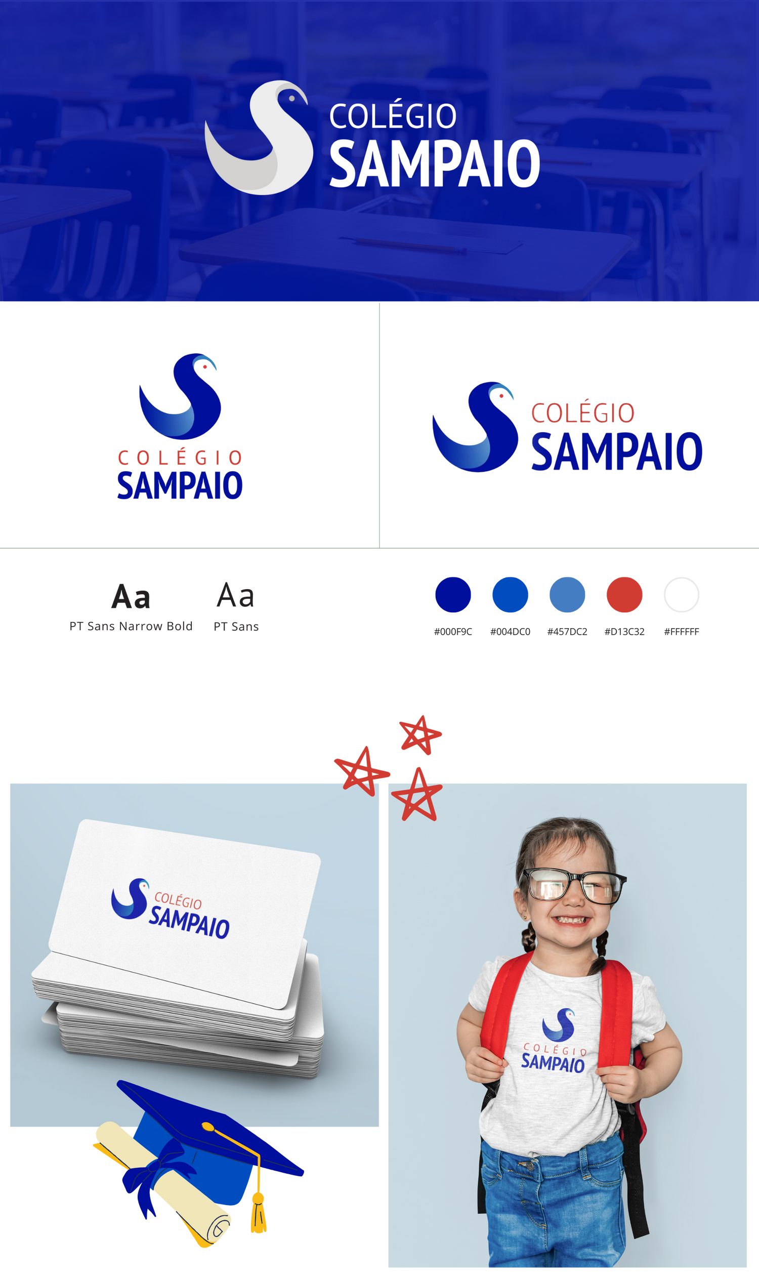
Branding
Colégio Sampaio (Sampaio School)
The branding design for Colégio Sampaio showcases a seamless blend of modernity and sophistication. Centered around a captivating indigo blue gradient bird, ingeniously crafted in the shape of the letter "S", the logo symbolizes growth, freedom, and progress—the very essence of education. The use of a vibrant red hue for the first word adds a dynamic contrast, drawing attention and evoking a sense of energy and vitality. Complemented by a sleek sans-serif font, the design exudes professionalism and clarity, reflecting the institution's commitment to excellence and innovation. This distinctive branding identity resonates with the spirit of Colégio Sampaio, setting it apart in a competitive landscape and leaving a lasting impression on its audience.
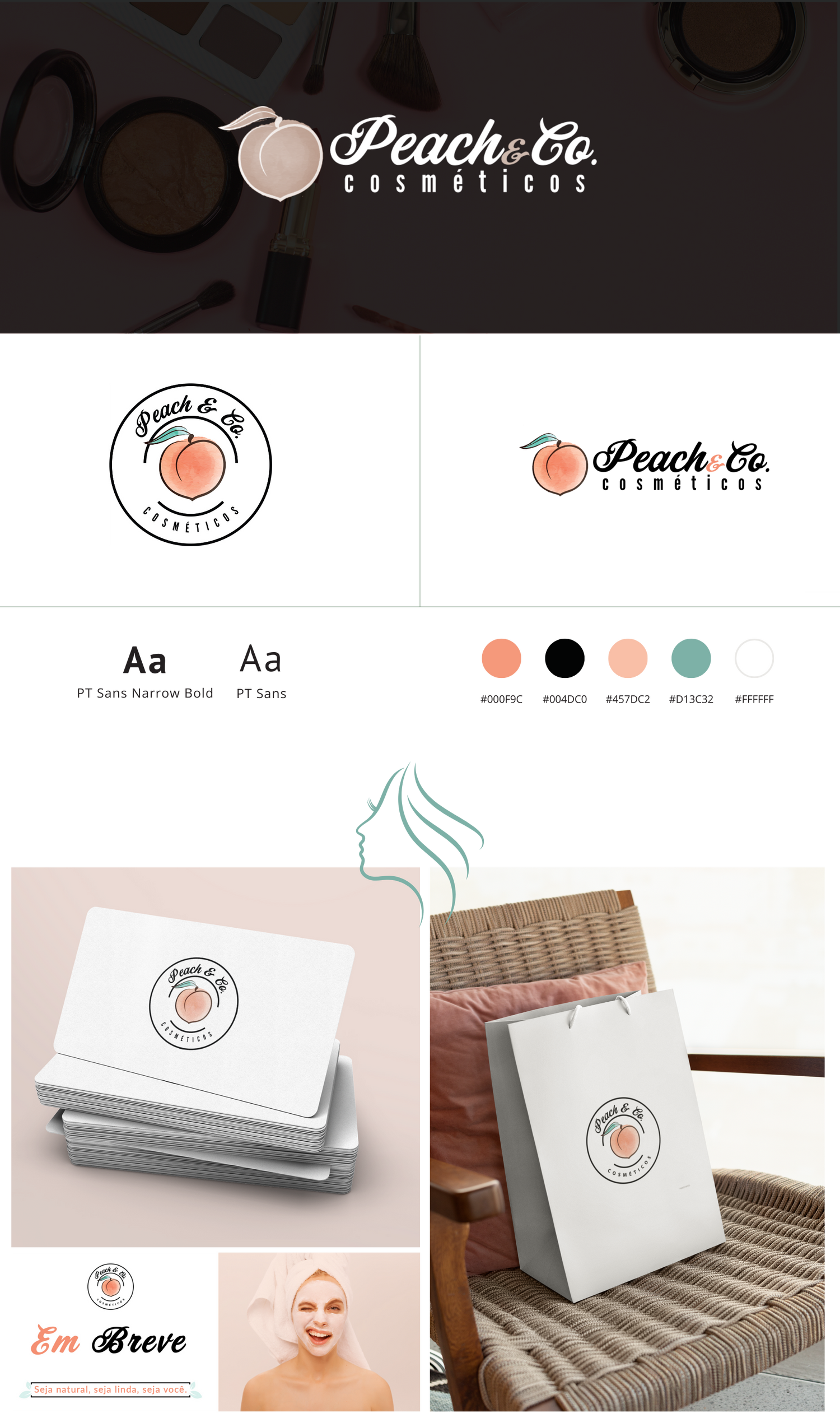
Branding
Peach & Co.
Introducing the vibrant and captivating branding design for Peach & Co., a leading beauty company in Brazil. Inspired by the luscious tones of nature, the color palette revolves around a soothing salmon pink, evoking a sense of elegance and femininity. Complementing this palette is a delightful peach icon adorned with a fresh green leaf, symbolizing vitality and natural beauty.
The typography selection further enhances the brand's identity, featuring a harmonious pairing of a bold script font exuding warmth and personality, alongside a sleek narrow sans-serif font for a modern touch.
This branding design encapsulates the essence of Peach & Co., marrying sophistication with a playful charm, inviting customers to indulge in a world of beauty and self-care.
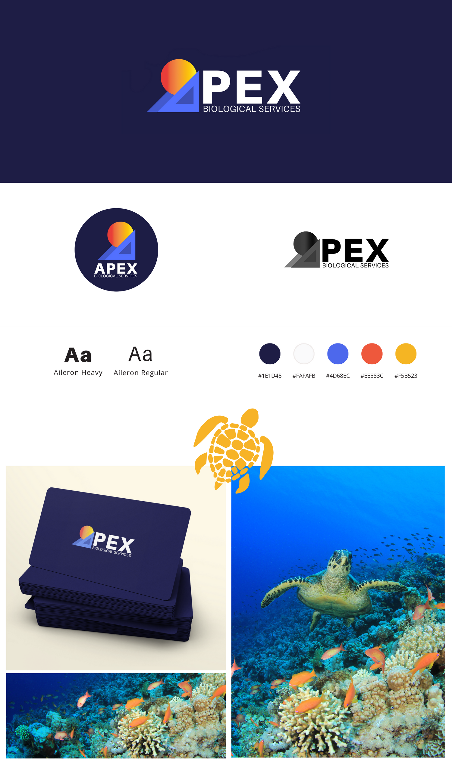
Branding
APEX Biological Services
Branding:
Logo Design: The logo features a blend of geometric shapes in deep blue, shades of blue, orange, and yellow, with bold sans serif fonts for a modern and professional touch.
Color Palette: Deep blue symbolizes reliability, while shades of blue evoke trust and stability. Orange and yellow accents add vibrancy and energy, reflecting the company's dynamic approach.
Geometric Shapes: Incorporating geometric shapes adds a contemporary flair, conveying precision and aligning with the company's commitment to environmental consulting.
Font Choice: Bold sans serif fonts enhance readability and convey strength and confidence, complementing the modern aesthetic.
Overall Impression: The branding design achieves a balance between sophistication and approachability, effectively representing Apex Biological Services Environmental Consulting.